Showing posts with label Advertainment. Show all posts

Sunday

Wii's Wario Land YouTube Video- Welcome to the Future of Online Video


Nintendo Wii, the system which has rocked the video gaming world and created a new definition for the word "interactive," has set an unparalleled precedent with their new YouTube Video. If you have 45 free seconds, please CLICK HERE for a brief preview of the future of YouTube, and interactive online video in general.

The geniuses behind the promotional efforts for the video game "Wario Land: Shake It" have created a YouTube 1st- a video clip that actually manipulates the entire YouTube page that contains it...boxes and type on the page tumble and bounce around as the video plays (while the virtual player "shakes" the video itself). As the chaos ensues, you can actually grab the falling pieces of the page with your mouse cursor and move them about while the video plays. This is rather hard to explain, so perhaps it is best if you Try it Yourself.


This video, which was posted just a couple of weeks ago, on September 19th, already has nearly 3 million hits...and I expect it to get at least 3 million more within the next week or so. It has amazing viral possibility, and brand spiraling potential for the game's Promotional Web site.


The promotional site also includes a great little advergame with a nice cross-promotional plug for Six-Flags. You can check it out by CLICKING HERE. This microsite fits in with the overall campaign in that it too requires the user to "shake" things on the site with their cursor. The minds at Nintendo have yet again figured out how to take a traditional medium and add new, inventive ways to enhance user/player interactivity.

The Wii is already hard enough to get as it is...with people still signing up on long wait lists at even the most frequented and usually highly stocked box stores. My guess is that this game, and the fantastic, innovative web-based promotional and WOM-oriented marketing behind it, will only lead to more interest in the Nintendo Wii. And I don't think that I need to explain how exciting the implications of this nature of embeddable video technology are for online video and interactivity as a whole.

A big thank-you to Rocco Stallvord at Adverblog for bringing all of this to my attention through THIS POST.

Saturday

Audi Truth in Engineering Mini Site


At the beginning of ’08, Audi came out with a beautiful new mini site to showcase its models. A relatively simple web site, Truth in Engineering maintains the emphasis on the car models themselves through a well placed sub-navigational bar at the bottom of the page, which, when the cursor is dragged across, has the rollover effect of bringing images of the models to the forefront. But this sub-navigational bar is subtle enough that it allows the more entertaining aspect of the page- namely the video content- to take center stage.

The mini site also allows for additional exposure for Audi’s recent Television campaigns- one TV Ad, shown on the site and on TV (including some not-too-cheap Olympics placements) is entitled “Truth in Progress.” This Ad does a great job of representing the brand image that Audi is trying to portray these days: one of luxury, style, and top-of-class excellence. And the commercial is anything but bashful in the way that it comparatively shows ‘the old paradigm of these values’- Mercedes, and ‘the new one’- Audi.


Audi even takes a stab at humor with its “Truth in the Godfather” Ad, which parodies the timeless scene in the Godfather where the record studio guy wakes up with a horse’s head in his bed…which is Corleone’s apparent solution for when his statement “I’ll make him an offer he can’t refuse.” Except in this Ad…it’s not a horse head- it’s another strong brand name that Audi wants to show as dead…or dying, and being trampled overfoot by Audi.


Also notable on the advertainment side of things is another video on the site which is a cross-promotion for the movie Iron Man- where Audi has some obvious product placement interests.

The site itself is sleek, classy, and very well designed- which brings up the point that the site does a spectacular job of maintaining the overall look and feel of the Audi brand. This speaks to the fact that a web site, even a specialized mini site such as this one, is a virtual proxy for the brand itself. As such, this site fits well into Audi’s integrated marketing communications goals.

Wednesday

Orange Internet Balloon Race


Orange Business Services
, a subsidiary of France Telecom, has come up with a cool (as well as crazy, and a bit convoluted) campaign called “The World’s First Internet Balloon Race.” While this campaign yet again belongs to a company outside of our sheltered US borders, and so deviates slightly from the original purpose of this blog, the amount that this campaign depends upon the online chatter through the blogosphere (which is global in scope, and thus also concerns the US) makes it easily relevant enough for a posting.

Poke, an ad agency in London specializing in interactive, web-based projects, created this Web site and the campaign itself, which is already storming the blogosphere, as intended, though the actual “race” doesn’t begin until June 22nd.

So, to get to the point, Orange has created a new “animal tariffs” system for pay-as-you-go phones and communications devices. For this new concept, they are using animal symbols to represent the different possible pay-as-you-go packages. So…Poke came up with the idea of this internet balloon race as a viral web-based promotion for Orange. Check out these packages below:


The idea is that you go to the home page of the Balloon Race, choose a balloon animal, name it, write a little message, and then you’re off to the race! So, basically, from what I gather, you just try to generate as much buzz as you can around your personal balloon (which, in turn, virally markets this campaign like crazy). As word about your balloon spreads by getting more and more attention online, you gain “internet miles,” which propel you towards victory. The winner of this race gets a 7 day all-expense paid trip to Ibiza for themselves and “a gang of [their] friends,” with a “luxury private villa with a pool, tennis court, personal chef,” et. Al. But to keep the less-than-Lance Armstrong racers interested, they also give out small daily prizes based on a raffle system for people who meet a certain daily quota of online attention.


Perhaps the only downside to this campaign is the lack of content explaining the actual relationship between the animal balloons and animal symbols for pay-as-you-go; there is very little correlation between the balloon race and Orange at all. I had to do a bit of digging to figure out exactly what the relationship was. I think that this could be easily remedied by making the “join Orange for free” section on the Balloon Race site more visible, right now it is a tiny link on the bottom-left-hand side of the page, which is way too peripheral; in my opinion it should have a much more obvious presence on the Web site. It’s important not to lose sight of the fact that ultimately this campaign should directly promote Orange itself, perhaps even resulting in a sale or two. However, overall, this is a very clever campaign that has already crossed the pond (the Atlantic) and is gaining tons of momentum in terms of online WOM, and the race hasn’t even started yet!

Props to Martina over at Adverblog for Spreading the Word about this neat new campaign.

Friday

Welch's Grape Juice People Magazine Ad


So, I’m back in the US again, and I had forgotten just how infatuated everyone here is with movie stars’ lives. Thanks to my girlfriend’s curiosities about who’s dating who, and other equally important issues in the celebrity and celebutant world, I once again (see my old post about a Nikon Camera ad in a People Magazine) stumbled across a great piece of unusual print advertising in a People Magazine.

In the February 2008 edition of the magazine, Welch’s Grape Juice put out a great ad. The front page of the ad itself seems at first glance to be a cologne or perfume ad, but it is far from that. The front of the ad shows a bottle of their grape juice next to what looks like a pull-out perfume insert (we’ve all seen these…the ones with a scented piece of paper inside for the sample), but next to this it says “For a tasty fact, remove and lick.” So…if you then pull off the glued-on foil paper, beneath it there is a claim that states “Welch’s had twice the antioxidant power of orange juice. It helps protect your immune system.”

However, the truly different part of the ad is what is inside of the foil paper that you just removed….concealed within the paper is a little, edible purple square. This little square is actually a solidified, synthetic representation of the real Welch’s Grape Juice that you can put on your tongue and let dissolve.


So, Welch’s (or whichever ad agency represented them on this project) delivered several valuable messages through this ad. The first is their central-route message, which is basically the claim about the antioxidant power, and resulting immunity influence of their grape juice. The second takes a more peripheral route, which is providing the sample itself simply to get attention, and, hopefully, retain it after the reader turns the page, and maybe even after they set the magazine down. For me anyways, it certainly sticks out in my mind, as this is the first instance of a taste-test sample of this nature that I have ever seen.

On the back of the foil envelope with the sample inside, it says “Peel ‘n Taste® Welch’s Grape Juice Flavor Strip.” At the bottom it says that the sample itself was manufactured by “First Flavor, Inc.,” and provides their Web site as: www.peelntaste.com. I’m personally very interested to see what else this company comes up with, and who else utilizes their brilliant idea of throwing edible samples (or “flavor renditions” of the actual product) into magazines and other print vehicles.

Telefonica Cathedral Building Wrap

I apologize for continuing to deviate so far from the original theme of this blog (Advertainment solely in the United States)...but it is tough not to post about that which I see here in Spain...as with many other things, namely fashion and design, marketing innovations also seem to start over here in Europe. Once they are adapted on a relatively widespread basis here…the (often more conservative) marketing and advertising firms and agencies across the pond in the U.S. start to try them out. So, in my defense, many of the campaigns and Advertainment oddities are well worth their while here, and deserving of a post on this blog.

While the concept of the building wrap is anything but new, the approach that Telefonica, a Spanish telecommunications company that has monopolized (in the truest sense of the term) the market here has taken to the traditional building wrap is pretty neat.


The Catedral, (Cathedral…if you don’t already get the pretty obvious cognate) is an enormous, gorgeous Gothic church which was built in 1298. It is a massive structure that draws in hoards of tourists regardless of the season. But perhaps the key to the Catedral is that it is located relatively centrally in the city of Barcelona; with a large open courtyard in front of it through which numerous people walk through daily (not only tourists, but also Spainards, who are the people that Telefonica most needs to reach).

Right now, renovations on the Catedral are being done; renovations which are likely to take at least a year or more. So, as is often done, Telefonica bought ad space on the building wrap that hides the construction. However, what I personally find neat is that the building wrap itself depicts what it is hiding…the parts of the Catedral that it covers.

This is clever on Telefonica’s part for two reasons:

1. For the aforementioned reason, that it is not necessarily an ugly ad…and due to the fact that it shows the Catedral behind it, it makes the construction itself less obnoxious.
2. The ad itself says “Telefónica dóna suport a la restauració de la Catedral,” which, loosely translated, means “Telefonica donates to support the restoration of the Cathedral,” so Telefonica also comes off looking like a Philanthropist here…adding to the social good…and they may have even received tax cuts for their philanthropic efforts for the Catedral restoration.


Marketing can’t solve a company’s management problems, but it is a pretty important piece of the puzzle, and in the case of the Catedral building wrap, Telefonica seems to have done something right.

Monday

Motorola Razr2 Sidewalk Art

Apparently my previously bi-weekly postings have devolved into a once monthly affair, and for this I act contrite. Things are somewhat overwhelming across the pond over here in Barcelona right now; travel, work at ACV Global, and school have been keeping me pretty tied-up, and away from US Advertainment. However, it is always in my mind…in fact, through many of my travel exploits, having a camera in hand has been a positive for this blog. In fact, while the campaigns that I have seen here are not of the American variety, I feel as though some of the cool things (namely guerilla marketing tactics) that I have seen first-person here in Barcelona merit a position on this blog.

Recently Motorola had a nice little event down by the Mediterranean in Barceloneta (actually very close to my place) for their Razr2 (the new generation of the Motorola Razr being marketed with hopes of resurrecting the success of the initial model…and doing so much more than the Krazr even did). The best part of the event was a bit of sidewalk art. I have always been a Julian Beever enthusiast, as he is one of the best sidewalk artists that I have ever seen. I am not sure who exactly created this piece for Motorola, but it is of extremely high quality as well, and it was even better before the bicycle wheels, and people’s feet got to it and distorted it a bit.


I have always found sidewalk art to be a great unconventional marketing technique. While the exposure is obviously sub-par, the impact that the ads have is enormous. The other obvious problem is perishability, as the less-than-excellent picture above shows…if people don’t see the ads quickly, they aren’t likely to see them in good quality, if at all. However, I still believe that they are an excellent way to generate awareness, and spur a lot of good word-of-mouth. This is exactly what Motorola will need to break into the already over-saturated cell phone market with their Razr2 here in Spain.

Tuesday

Burton Sabotage(s) Stupidity


Hello again. Sorry it’s been so long since I last posted…I’ve been abroad in Barcelona, Spain, and its been rather hectic…though amazing. Also, I apologize in advance if this post seems less eloquent than usual, it seems that the more Spanish I learn, the less English I retain…oh well, not a bad trade-off I suppose. At any rate, while I am here in Spain, the American advertainment campaigns have not ceased to exist; in fact, they are only getting better. The most notable campaign as of late is attributable to Burton, which designed a nice little web site and viral marketing concept. The concept revolves around the site (and corresponding slogan) “Sabotage Stupidity.”

Rather than paraphrase the entire campaign concept, I have posted a picture of Burton´s “mission statement” for this concept below (click on the picture to enlarge it so that it is actually legible).


As of the day that I write and post this (January 22, ‘08), there are no videos uploaded yet, and there is only one picture. This campaign began in early January, so it has been nearly a month. I will be interested to see whether or not people actually upload a lot of content. I love the idea of user generated content; it often works extremely well, adding credibility to the brand in the eyes of the consumer, as it is not a direct, brand-created advertising message…but this nature of content only works if it is executed well, and if enough interest is built up around the campaign concept. Sabotage Stupidity is certainly not lacking in creativity, so the interest should be there. Perhaps the monetary incentive (a $5,000 grand prize) isn’t high enough to warrant the inherent risk involved…or maybe the campaign just hasn’t been promoted enough in Burton stores or through traditional media. Whatever the cause, I hope that this gets worked out, because I am interested in seeing this campaign succeed.

This entire campaign concept obviously brings up some ethical/legal issues…it will also be interesting to see if there is any backlash from the four resorts that are to be “poached.”


Thanks to Marc van Wageningen over at Direct Daily for writing about this Here.

Wednesday

Bob Dylan Advertainment Messaging Site


How exactly this Web site, which started in late September, slipped past me is beyond me, because it’s great. I suppose it is rather inconsequential at this point anyways, though; the nice thing is that I found it. Created by Ten4, this highly interactive site, Dylanmessaging.com, was created to promote “Dylan,” which is a greatest hits compendium available in a 1 CD Edition, or a 3 CD “Deluxe Digipack” Edition, both of which you can buy directly from the Web site (always a good idea from a production standpoint). The entire site is designed to look like an album cover of sorts, though it also comes off slightly resembling an old newspaper.

In addition to being able to buy the actual album, and being able to find out relevant information about it, the site also links to other Dylan works such as “No Direction Home,” directed by Scorsese, and several other DVD’s. But the site is designed and engineered around the Messaging concept. If you click on “Send Someone a Message,” the truly interactive part of the site becomes visible. Here you can create your own message, which can say anything, on 10 different sheets of paper, which Mr. Dylan himself (from 40 years ago) will hold up…you can then send this message to your friends via email. Of course, at the end of your message there is a quick plug for the new Dylan album.

Check out the neat little video that I made Here. After you create your own message, you can click on “The Video,” where you can view the entire music video for Dylan’s song “Subterranean Homesick Blues”, which is the background (and the canvas) for the message that you, yourself create. According to the site, which actually took its synopsis of the video from Wikipedia, “The video takes place in an alley behind the Savoy Hotel in London where poet Ginsberg and Neuwirth make a cameo in the background.”

This site is certainly a must-visit for any big Dylan fan, and it is well worth the visit for anyone who has even a slight interest in him and his music. And for those who have no interest in Dylan at all (though I would find this somewhat hard to believe), the site is great for its viral marketing and advertainment value, at the very least.

Sunday

Nikon D40 Camera- Picturetown Advertainment


So, the new campaign concept for the Nikon D40 Camera may not exactly fall within the confines of what is traditionally defined as advertainment, but advertainment itself is untraditional, so I think it is ok to post about this neat new campaign. I found out about this new ad campaign through a wonderfully well-placed (and probably pretty expensive) hard-stock insert of a picture of the D40 camera itself, in its actual size. I found this ad in the December issue of People Magazine (it was my girlfriend’s copy of the mag., I don’t usually read it, I swear). Next to the insert is a traditional, full-bleed ad that describes the overall campaign concept where it says “Go to stunningnikon.com/picturetown for proof that people start taking amazing digital pictures the minute you hand them a Nikon D40. Recently, we gave 200 D40’s to the people of Georgetown, SC. Check out their pictures and learn more about the Nikon D40.”


I instantly took a liking to this ad due to the fact that the insert catches the reader’s attention immediately (also, the pages automatically open to the insert if the mag. is set down, due to its hard-stock, which is always a good idea), and the ad provides more information. Plus, the camera insert itself opens up, with a similar description of the “Picturetown” idea, and also an added incentive for people to check out the Web site: a sweepstakes that automatically enters you in to win a trip for two to Tuscany, Italy if you visit the site. Now that is good stuff…the insert catches attention and breaks through the clutter, the ad further explains the concept, and the inside of the insert gives added incentive to learn more, all the while, every piece of advertising has the Web site in bold yellow letters on a black background, now that’s excellent brand spiraling.

The site itself is where the advertainment comes into the picture (corny, I know…) a bit more clearly. You can select from a number of options on the site, which is simply yet sleekly designed, including “The Story, The People, The Pictures, The Nikon D 40, and Enter To Win.” Before you get to the homepage, however, the site loads and the message displayed sets up the premise for the entire campaign, it says “Anyone can take a great picture with the Nikon D40. To prove it, we gave 200 to the people of Georgetown, South Carolina.” I find this message to be well-thought, and well-directed…I like the idea.

Once the site loads, if you click on “The Story,” an informative video shows the whole process of the cameras being handed out, and it re-emphasizes the average Joe factor here, showing that these people are just like you and I, and by no means photography experts. “The People” further proves this fact, and then “The Pictures” section really drives home the point that the camera is capable of taking good pictures, even when in the hands of average Joes. This section is set up as a large, interactive gallery, where you can see a bunch of thumbnails of photos at once, scroll over them to get more info., and then click on them to see a bigger copy. Overall, Nikon shows a good melding of traditional methods of advertising (magazine, etc.) in an untraditional format (unusual insert), and good use of interactivity on the Web site itself; all of this adds up to good advertainment.

Thursday

National Geographic Channel Dinosaur Advertainment & Advergame

Interesting news for fans of advergames/closet archaeology and paleontology enthusiasts such as myself: The National Geographic Channel has created a new advergame to promote two of their new specials, Dino Death Trap and Dino Autopsy, which aired on December 9th.


This advergame, called “Fossil Hunt,” is part of a full-fledged microsite for the two aforementioned shows. The site itself (which you can check out Here) is pretty well-rounded. It offers a lot of video and other interactive content. You can preview the shows themselves, check out photos of actual dinosaur fossils, and even try the “3D Dino Explore” feature on the site, which is a relatively-rudimentary click-and-drag view of virtual dinosaur likenesses buried under the earth; you can “Revisit their last moments and see these dinosaurs in full 3D.”

The Fossil Hunt advergame itself is a 3-D tile board akin to mahjong, but where you attempt to match two of the same dinosaur bones in order to make them disappear from the dig site. As an archaeologist-gamer, your goal is to assemble the full dinosaur in order to advance to the next level. The game is very simple, suggesting that it may be an attempt at marketing to a younger demographic audience, or maybe just a quick way to throw together an advergame. The site was, in fact, first made available on Dec. 3rd, only a week before the shows aired.


I think that it’s safe to say that nearly everyone had a pretty decent interest in dinosaurs when they were kids; and why not, what is more enigmatic than a giant creature that lived on earth millions of years before you were born? So, go ahead and indulge in your childhood fascinations, check out the National Geographic Channel Dinosaurs Microsite.

To read a bit more about this site, and the two shows it was created to promote, take a look at This Article by Shahnaz Mahmud over at Adweek.

Saturday

Milk Gets an Advergame


While the campaign started quite a while ago, and so is anything but new on the rapidly changing Internet landscape, I just barely found out about it, so it is new to me. The Get The Glass advertainment site and advergame was created by North Kingdom and Goodby, Silverstein & Partners for the California Milk Processor Board (creator of Got Milk? fame, etc…). This site is truly a work of art, and evidence of the boundless capabilities that increasing virtual design technologies are allowing. Put plainly, it is web-based advertainment done right.


The site follows the chronicles of the Adachi family, which the introduction describes as “A family struggling to overcome a staggering predicament: Life without milk…Only one thing may help them: The power of the glass.” So, your goal as the player of the advergame is to help them get to the glass on the massive 3-D island that includes various types of terrain and precarious places to pass through on the way to “The Glass” which rests on the top of a large fortress. Before actually playing the game, the site user can take a look at the entire island through a 360 degree tour of this graphic extraordinaire. The island’s design has a very dark, gothic, Tim Burton-like feel to it, which works as a stark contrast to the giant illuminated glass of milk that you are supposed to reach. When you play the game itself, it is set up as a giant monopoly type of game board which prompts the user to roll a die in order to determine the Adachi family’s next steps on the island, ultimately determining whether or not they reach “The Glass.” There are numerous small-scale games embedded within the main game; these are mini-missions that aid the family in their plight, one such mission is driving a truck to escape island security.


Perhaps the sites only immediately visible flaw is its large loading time upon entrance to its main page. However, the slow loading at the beginning is the only large load time on the site, and it is well worth the wait to enter. The load time is a small price to pay for the enormous amount of visual detail and excellent overall design that the advergame offers. Get the Glass proves to be yet another excellent promotional tool for the California Milk Processor Board.

Thanks to Rob Ford for bringing this site to my attention through posting about it on Adverblog (through Martina). Check out this post Here.

Friday

Dr. Pepper iPhone Advergame


Yet another company is riding the popularity-wave of the apple iPhone, and creating a specialized program for the product (check out my old post about Warner Bro.s’ I am Legend). Dr. Pepper is reaching out to its sugar-craving consumer base with an advergame that is to be distributed solely to iPhone users. This soon-to-be released game is, in fact, the first branded game ever to be made available on the iPhone, and, should it succeed in its objectives, it will likely be the first of many.

This game, called “Matchcaps,” was created specially for the iPhone’s safari internet browser. This game, created by Imaginuity New Media, will be free, and it will not even need to be downloaded to the phone. It will be accessible through the site: www.drpepper.com/matchcaps. If you already have safari as your internet browser on your home computer, you can actually access and play the game on your home computer, should you not own the $500 iPhone.


This game marks a relatively large milestone for Dr. Pepper, as it is clever of them to once again be at the cusp of what is new and exciting in the world of untraditional, unconventional marketing in the form of advertainment and advergaming. Being first-to-market with this advergame for the iPhone marks yet another good move for Dr. Pepper’s parent company,Cadbury Schweppes Americas Beverages. They are still riding the coattails of the increasingly popular “Phil Collins Gorilla Drummer Cadbury Ad” which has nearly 1.5 million hits on its most popular upload link on YouTube (check it out below). As unrelated as this ad may be to any of Cadbury’s products, it is still tremendously captivating, and pretty funny to boot.


If you want to find out a bit more about Dr. Pepper’s Matchcaps game, check out this CNN Money Article.

Wednesday

Subway Family Guy Advergame


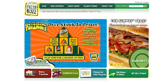
Subway, king of mass produced meats and cheeses loaded onto six-inch rolls, has created a pretty decent advergame in affiliation with the TV show Family Guy. Available Here, “The Quahog Triangle” is a sweepstakes giveaway type of game, seemingly modeled off of McDonald’s success with their annual Monopoly giveaway efforts.

When you enter The Quahog Triangle, you are immediately prompted to give your email address in order to participate, which is pretty clever in itself, as this is an excellent way to track the campaign’s success, as well as to add names to the surely ever-expanding Subway customer database. You also have to submit your physical mailing address, as well as your birth date. Also, surprise, surprise, the text that allows you to opt out of future mailings through Subway is rather small and discretely located on the sign-in page. This is by no means a bad idea for Subway, however, as increasing their physical mailing list will be nothing other than beneficial for them.

Through the game, you can “Test your trivia smarts, send an e-card, play for a chance to instantly win over $100,000 in cash and prizes…and more!” The entire game, obviously, is designed and executed with a Family Guy theme and format. This is a rather clever affiliation, as long as Subway is hoping to target a younger demographic with their marketing efforts here. I suppose that any high school kid with some lunch money in suburbia may become somewhat more predisposed to select Subway as their luncheon destination of choice after playing this game. Then again, maybe not. However, either way, they have covered all of their bases with this campaign, and done as much as possible to promote it (so it seems).

Making the game incentive-based will likely greatly increase the participation rates, making it based around Family Guy may even further increase those rates. In addition, they have solicited some pretty decent affiliate promotion for the game; maxim magazine is one example of this. They have increased their visibility through Maxim’s Online Contests, where there is an animated link to the game. This audience is likely on-point, but it may be a stark contrast to Subways usual, wholesome, family-oriented brand image that they try to display. Integrating their marketing communications in order to deliver a consistent brand image may not be Subway’s strong suit. However, the odds that this game’s promotion on maxim.com would be brought to the attention of conservative Subway regular patrons are rather slim, so this will not likely hurt them in any way.

The Quahog Triangle game itself is as simple as clicking a button to start the triangle, and clicking a button to stop it. It is essentially a free, virtual slot machine. However, as always, luck doesn’t exactly prevail for me…I lost. If anybody plays it and actually wins anything, please let me know through a comment below. Upon losing, you are prompted to “Tell your friends” about the game by way of an E-Card to their email address…this is a good way to increase word-of-mouth about the campaign, and a way that makes it easy for the user on the site to do so.

The game itself lacks any true Family Guy humor; in fact, it is basically devoid of humor of any kind, which is a bit strange. However, overall, it is a good co-sponsorship tool for Subway to promote its products, and for Family Guy to promote its show, and the Family Guy Season 5 DVD Boxed Set, which is now available for purchase.

Friday

Facebook to Offer Advertising Space: Marketers Rejoice


Facebook just announced that it will begin to sell ad space, and will offer several packaged advertising initiatives. This social-networking giant has over 50 million users, the majority of whom are Gen-Y’ers that are usually unreceptive to traditional advertising means and methods, due to the fact that they have been inundated with them since they were old enough to recognize the shape of a man on a pony, or a fabric alligator. Needless to say, marketers have been chomping at the bit for the opportunity to be able to get to this elusive group of people. They may just have this opportunity with Facebook.

Facebook is now going to offer several different prepackaged services. The first is “Brand Profile Pages,” which are essentially profiles similar to individual users’ profiles, but that serve the purpose of soliciting and promoting a brand name, and its products. They are not really re-inventing the wheel with this one, as Facebooks’ main competitior, MySpace, has been doing this for ages. However, it will be interesting to see how the Facebook corporate profiles compare to those on MySpace.

The second spice that Facebook offers is “Tailored Ads,” which essentially just allows individual Facebook users to sign up as a “fan” of a brand, which is basically akin to “poking” a “friend” in the usual community. If someone cites themselves as a “fan” of a certain brand, and its profile (which will likely offer some kind of incentive for the person to do so, such as free downloads, etc.) then the brand has the ability to notify that person’s Facebook friends about this new relationship, and an ad, of course, accompanies this notification.

The third Facebook offering is “Partnerships with Retailers,” which is another Friend notification system that will enable the company that is partnered with Facebook (there are currently 44 retail sites that could afford the, surely, massive bid to become affiliates) to make all of a Facebook users’ Friends savvy to any transaction that particular individual makes with said company. If that makes no sense, here’s an example: If you rent a certain movie from a Blockbuster (on of the lucky 44 affiliates), then your friends on Facebook will know about it.


However, Facebook has, until now, been an advertising-free haven where people can communicate and collaborate without having to see countless ads. The two big questions on the top of my mind are: 1) Will Zuckerberg and his crew of flunkies be able to display ads in a way that is tactful and clever enough not to perturb the loyal Facebook users too much?... and 2) If the advertising and marketing tactics become too invasive, will the users slow or cease their site visits, or protest in some way? Only time will tell, I suppose. From a business perspective, you can’t blame Zuckerberg for finally taking the advertising bait that has been dangling in front of him since Facebook began. It is about time that this super-hyped, amazingly-highly appraised social networking site begins to live up to its monetary worth, and build some tangible revenues for its owner(s).

To read more about all of this, and to take a look at some staggering financial figures, check out This Article, written by Laura Petrecca and Jon Swartz of USA Today.

Thursday

Norelco’s Shave Everywhere Advertainment Site


So, one of Philip’s subsidiary companies, Norelco, has created a funny new buzz marketing (get the double entendre?) site to promote their men’s electric razors. The brand of humor that they use is pretty over-the-top, but it caters appropriately to the demographic that they are trying to reach. The age demographic would likely be between 18-28, and the gender would certainly be men.

The site is called Shave Everywhere, and it is made specifically for the Philips Norelco Bodygroom, which is an attempt to re-market the traditional electric shaver in order to specialize it to shave extremities that are far from the face. The spokesperson for the site is a young, 10 o’clock local evening news type of personality with flawlessly parted hair, wearing a white bathrobe. The Bodygroomer’s possible applications are, thankfully, not demonstrated on a person, but, rather, by the humorous juxtaposition of several different kinds of fruit next to the guy…at least on the introduction to the site. If you select “Where to Shave” from the main menu, however, things get a bit more graphic. Blue circles point out the various areas that the Bodygroom will supposedly shave with ease…and this is done on the actual guy…such as the “Groin and Posterior,” and the “Underarms,” fortunately, the guy’s robe stays on all the while.

The “History” section is also pretty hilarious. An old guy, named “Follicle Phil Fontana” prefaces this little doozy saying “Things were different then…we didn’t have no calculators or internets…no…Bodygrooms. Back then, If the hair on ya back or ya co** or your ***** got too long…well, ya might just have ta live wid' it, ya know?” Then, the spokesperson of this site gives us a lovely anecdotal history of the Bodygroom, and the way it has benefited society since its inception. He speaks of unfortunate souls such as “Harry Hair Vest Houllihan,” and “Checky Mansweater Reubenstein,” and the terrible times that they had to go through on the beach back on Coney Island. The History goes on in much greater depth, but it is best that you venture on to this section of the site and learn this horrific history yourself.

Another point of possible interest on the site is the “Music Video,” which features the spokesperson himself talking about the hard times that he went through before finding the Bodygroom. “It’s so hard to be a Don Juan when you’ve got a Chinchilla wrapped around your Don*.” It gets worse from there…again, I’ll let you decide whether you want to hear more or not. This section, much like the rest of the site, has censored profanity…but it is still pretty easy to distinguish.

Maybe my favorite part of the site, for its subtle and yet excellent comical value, is “The Optical Inch,” which is an eye exam with the message “I love my extra inch” hidden, though not very well hidden, in the text.

In summation, not much of this site is made for the ultra-conservative or the Parents Television Council. It is not exactly family-friendly, but, to some people it is pretty funny. You be the judge. At any rate, it is pretty brave of Philips to take this step and put something this controversial out there. My hat’s off to them for being so daring.

Many thanks to Anya over at SHiFT agency in Boulder, Colorado, for showing an active interest in my blog, and for notifying me about this hilarious new Norelco site.

Friday

Volkswagen Golf Auditions Advertainment


Yet I again I find myself blogging on an auto manufacturer that is on top of its game in terms of its marketing efforts. This time, Volkswagen is the company of the hour. They have recently created a Web site that definitely falls within the scope of effective advertainment. Golf Auditions is a clever little flash site that successfully combines humor and perhaps the oldest sales technique of all time: product demonstration.

The site opens to 7 people sitting in chairs, under the premise that they are waiting for auditions to see if they might be selected as the new salesperson/spokesperson for the Volkswagen Golf. Each individual represents a different car model, or a specific feature that adheres to all of the Golf models, and the talent on the site is hired to sarcastically, and blatantly represent their own Golf model, based on the people’s physical characteristics, as well as their overall mannerisms and idiosyncrasies.


Volkswagen makes some pretty bold moves with this campaign, namely through some of the more obvious physical traits of several of the characters that are supposed to represent a few different models. Perhaps the two most attention-grabbing characters are the naked hippie and the cross-dresser, who represent the environmental features of all of the Golfs, and the Cross-Golf, respectively.

On the site, the idea is to click on each of the different people who are auditioning, and they will then give you a run-through of their sales pitches / product overviews for their Golf models. Each video is short enough, and funny enough to retain the viewers’ attention, and they are all worth watching if you want to get a chuckle or two. The short videos vary in terms of the amount of actual product demonstration that they go into, but at the very least, each one demonstrates the unique features of the different models, and highlights several major key product features that are (obviously) shown in a positive light.

Will the site itself, by virtue of its content, get people to want to buy the cars? Probably not, but that is not what it is trying to do, nor is that usually the main goal of advertainment in general. Instead, the site will certainly leave the viewer with a lasting impression of Volkswagen, at the very least, which is an effective promotional tactic in itself.

Kudos to Martina at Adverblog (again!) for bringing this site to my attention through her post Here.

Sunday

Nissan Rogue Cell Phone Advergame


It seems as though the automotive industry is one of those the most in-tuned (get the double entendre?) to the latest marketing and advertising techniques. Again and again, I find myself posting on car companies that are making advergames (see my Scion post Here, and my Toyota Yaris post Here). It seems as though Nissan has decided to follow the recurring trend of a car company creating an advergame in order to market to a younger, extremely tech-savvy generation of car buyers.

Nissan is supposedly doing this in an entirely new way in the auto industry (though this is a self-stated claim); they have designed an advergame for their new Nissan Rogue vehicle which is to be used on mobile cell phones, but downloaded online. This game is to be one of several online “ad units” centered around the branding of the Rogue that people will be able to download onto their phones. The game is slated to be rather advanced, as far as cell phone games go, with accelerating levels of difficulty for the player. According to This Article from CNNMoney.com, “Additionally, the Rogue Mobile game breaks new ground with respect to performance tracking and measurability, delivering an unprecedented level of data and consumer insights back to Nissan.”

The game itself, and the rest of the digitized online content that accompanies it, was developed and produced by MangoMOBILE, of Omnicom, in affiliation with TEQUILA\, which is a subsidiary of TBWA Worldwide. Jamie Wells, VP of Strategy & Client Services at MangoMOBILE had this to say about the advergame and the online campaign in general: “While many are content with entering the mobile marketing space via simple text campaign, it's always great when a client like Nissan comes along and shows real initiative ... encouraging our strategists and developers to really push the envelope and launch a breakout mobile campaign that spans mobile gaming, online advertising, text distribution and even downloadable wallpapers. We are thrilled to be working with TEQUILA\ and Nissan on the Rogue launch, and look forward to working with them on even more innovative, more forward-leaning mobile marketing campaigns in the months and years to come.”

Nissan’s ultimate goal of this campaign sounds strikingly similar to that of Scion’s goal for its Little Deviants advergame. Robert Brown, Senior Manager of Interactive Marketing for Nissan in North America, explains “While the mobile medium is a perfect fit for the Nissan Rogue brand, we knew that we had to make it easy for consumers to discover and ultimately acquire the Rogue mobile content.” While Brown refers to the ease with which people can download this game online, he also subtly hints at one of Nissan’s goals for this campaign: increasing word-of-mouth. Nissan seems to be trying out the very same process of consumer self-discovery of the brand that has worked so effectively for Scion (yet again, check out my old post Here). Long story short, if something works the first time, use it again…and if something worked for someone else, emulate it to the best of your abilities and use it yourself.

Friday

EU Anti-Smoking Advertainment Campaign

Yet again I will be deviating from the main focus of this blog (advertainment solely in the US), with a post about a form of European advertainment. Sometimes I can’t help but post about European marketing and advertising efforts, because quite often they are truly at the cusp of innovation, incubating some of the best advertainment ideas around…before the same ideas finally ebb over to America across the Atlantic.

However, this time, it seems as though Europe may have taken a cue from America for one of their campaigns. A few weeks ago, the State Tobacco Education Prevention & Partnership in Colorado created a PSA of sorts in the vehicle of a Web site (Check out my old post on this Here). The primary target audience for this site is young adults between the ages of 18-24. Its main objective is to get them to stop smoking, or, better yet, to never start, if they haven’t already. Well, the European Union has come up with a clever campaign that seems to be oriented towards the same age demographic, and certainly for the same purposes.


The site is called Nicomarket, and it takes a slapstick, slap-in-the-face kind of approach to getting people to quit smoking. It is designed in a manner reminiscent of a 1980’s used car dealership…where large plaid jackets, oversized ties, and the hard sell sales tactic are king. It is actually a pretty funny Web site…it is not too over-the-top, which is good, because it needs to appeal to quite a few different countries (the EU is now up to 27 Countries, with three more candidates awaiting approval), but it is still pretty bold humor.

The general premise of the site is that Nicomarket is part of the company NICO ltd., a company that manufactures several different products, namely a face cream, toothpaste, a mouth spray, and an air freshener. All of the products have little videos that accompany them, which describe their features and uses. Each product is designed as a funny little way to point out the negatives of smoking. Check out a few of the better videos; go to the cream video Here, and the spray video Here

Thanks to Rocco Stallvord at Adverblog for bringing this campaign to my attention. Check out his post on this subject Here.

Tuesday

I am Legend Advertainment – iPhone, Second Life


Warner Brothers is jumping on the unconventional media bandwagon with the marketing of their new movie, I am Legend. Will Smith stars in what proves to be the umpteenth zombie horror adventure movie to take place in the last few years. In the movie, Smith apparently spends most of his time doing what any reasonable person would do in the same situation…running away from the people/things that want to eat him. Clichéd plot lines aside, Warner Brothers is doing things that are anything but trite with their actual marketing efforts.

First, they created a Section of their Web site dedicated solely to Apple iPhone users. This interactive mini site is actually pretty advanced, as I suppose it should be, seeing as how it is designed for one of the most advanced phones on the market right now. It comes complete with wallpaper and photos tailored to work for the iPhone, recent news about the movie, a full-length trailer, a brief synopsis of the movie, and a “Daylight Meter.” This little widget allows you to enter your zip code, and it then gives your geographic coordinates (based on latitude and longitude), and the amount of time left until daylight...because Will Smith has to hide from the zombies at night, get it? Does this little site serve a purpose? Not really, unless you are a special ops soldier (coordinates), or a vampire (daylight meter). Is it a clever way to use a new media? Yes. It is basically the new generation of a .mobi mobile Web site. As for whether or not setting up a mobile Web site for a specific brand of phone will catch on, this is a bit hard to predict. However, in my opinion, it seems as though this may be a bit limiting, due to the fact that it can only be reached by those with an iPhone; it makes more sense to me to simply set up a mobile Web site compatible with any internet-ready phone.

The second part of Warner Bros. outside-of-the-box thinking for marketing I am Legend is through yet another remotely untapped medium- Second Life. This part of their untraditional marketing efforts is truly the brain child of their operations. Warner Bros. has set up the “I am Legend Second Life Survival Game,” in which residents of the virtual world can play as a human or as one of the zombies. Either way, the main object of the game is to find the cure to the virus that spurred this crazy zombie outbreak. Now, if you ask me, this is good marketing. And it is so clever on Warner Brothers’ part, especially from a strategic management perspective. Instead of creating their own high-tech advergame to market this movie, they used a platform (or medium, what have you) that already exists…thus cutting back significantly on their costs of development and production…and also tapping into an already enormous consumer-base. In fact, as of this post, there at 10,255,064 users on Second Life, check out how many there are right now (as you are reading this post) Here. They have essentially created an advergame within a game. Well played, Warner Brothers.


So, the post-blog post kudos for this entry goes first to Angela Natividad over at Adrants, for posting This Article, which brought the I am Legend advertainment news to my attention, and second to MarketingVox for posting This Article, which supplemented the other things that I found elsewhere.

Saturday

Tea Partay Advertainment Videos

I have decided that it is time to revisit (see previous post Here)the Smirnoff Tea Partay video due to its brilliance, its success at generating word of mouth, and its relatively new, but yet equally successful counterpart, the Smirnoff Green Tea Partay video. These two short clips are a great example of how effective well executed advertainment can be.

The original Smirnoff Tea Partay video was released about a year ago, and, to date, it has been viewed over 3.7 million times on YouTube. Not too shabby. And let’s not forget that people viewing this pseudo-ad are doing so willingly. They are not a passive audience sitting back and ignoring this advertainmnet, rather, they sought out the video, and they actually want to see it. Also, they seem to like it, as the video has a 4 out of 5 star rating on YouTube.


Also, disregarding production costs for the video, which likely didn’t exceed that of any standard 30 second TV spot, what is the cost of airing this video? Nothing…so, what is the CPM for reaching 3.7 million people? Nothing.

Smirnoff recognized this, and due to the unprecedented success that they had with the video, they went ahead and released the Smirnoff Green Tea Partay video about two months ago. And, guess what, lightning does strike the same place twice. They have already had over 3.3 million hits on this video. My suspicion is that many of the people who saw the original video (such as myself) jumped at the thought of seeing another, similar video. So, what have we got here? Repeat viewing that (likely subconsciously) further substantiates the brand equity of Smirnoff in the viewer’s heads.


As for the videos themselves, I don’t want to describe them at all in this post, rather, I think it is best if you watch them yourself. In my opinion, they are remarkably funny. Check ‘em out.